

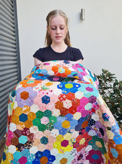
Hexie Harvest Quilt - How to Choose Fabrics for a Two Color Quilt
This quilt feels very different to my usual style. As an artist who wants my quilts to be recognised as mine, I have to admit that I spent some time wondering if I should be doing something different as I made this quilt. But I've come to accept that a really simple color palette is something I need to do every now and then. I find myself longing for it. Life gets busy or complicated, there are projects and finances to juggle, kids and other things that need attention, and suddenly all I want to make is the same color block over and over. I want to release myself from the burden of yet another decision to make and just sew.
Choosing Just Two Colors for a Quilt
Whenever I see two color quilts on Pinterest, I'm always drawn to them. The red and white, blue and white, or yellow and white were popular color choices for vintage quilts, and depending on the color chosen they can have such a subtle, calm beauty about them, or a striking contrast.
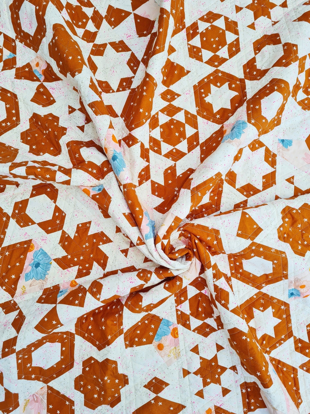
When choosing two colors for my Hexie Harvest quilt, I experimented with prints I already had in my stash rather than choosing off my computer. I played around with combinations, trying to pin down the kind of feel I wanted. I decided I wanted higher contrast rather than lower. So I took away any soft colours I had in the audition. I didn't want red, because I'd made a red and white quilt already (Red Sky at Night), but I decided I did want it to be a warm color. I was happy with rust or gold, but not yellow or orange. I even tried black but decided against it.
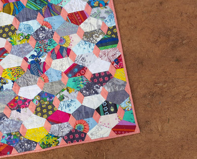
This Starry print in Saddle won out because it's quite a strong color, but the pattern is whimsical. I chose Speckled Metallic in Neon Pink for the ‘white’.
Because many of the blocks in my Hexie Harvest have three portions, I decided to add a third fabric, a very light pink with a larger scale floral called Salon Floral in Peach and Cream. It complemented both prints, and added a little occasional pop of color. All three prints are by Ruby Star Society.

Deciding on Color Placement Rules
The next decision I needed to make was about triangles. My Hexie Harvest pattern (found in the Hexie Handbook) gives you the option of adding triangles between the hexagon blocks or not. I decided to add these so that you could see the different blocks on their own, rather than the occasional pop of a star. I kept to the Speckled print for the white so that any blocks with white pieces around the outside would look like they were floating.
I also made the decision from the outset that any blocks with an inside portion and a border (either a hexagon with surrounding shapes or a star with surrounding shapes) would be white in the centre and gold on the outside. If there were any others that weren't so clear, I just decided, knowing that the triangles would be white, how I wanted the block to stand out from the white background.
An Easy and Fun Alternative to Scrappy
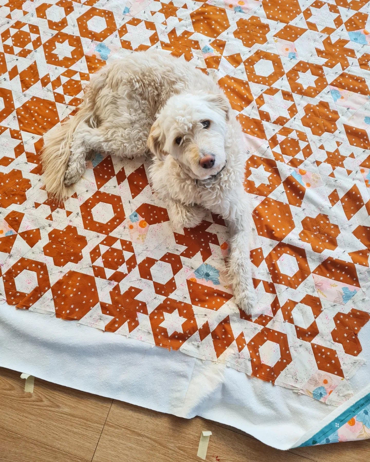
Because I didn't have decisions to make as I went, the quilt came together surprisingly quickly. And I LOVED it. I moved house twice over the making of this quilt, and I found it so easy to keep coming back to it because it was so undemanding. It's this reason that I'll continue to embrace two color quilts in my making practice even through scrappy is my go-to style. Every so often, when life demands a lot of me, I need a quilt that doesn't.
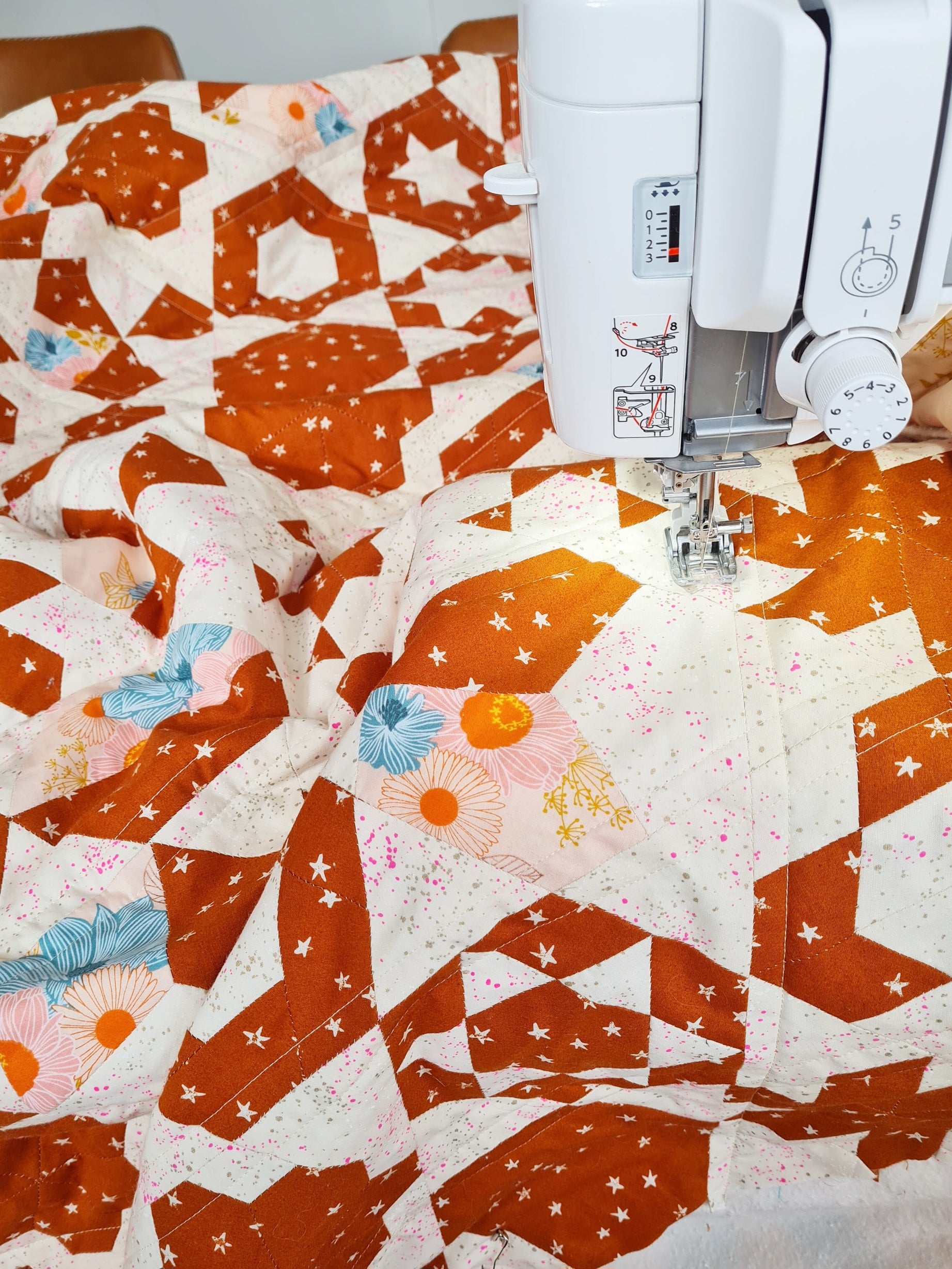
I quilted in straight lines ½" from each side of the hexagons and triangles. I used a light cream thread, and I love how it disappears in the white sections and stands out in the gold.

Binding - The Final Touch
Finally, for the binding, which I had assumed would be the gold stars all along, I settled on this blue woven stripe from one of Ruby Star Society's Warp and Weft collections. I had it in my stash from long ago, and I just love how it brings out the blue flowers scattered lightly throughout the quilt. Two color quilts often feel quite sophisticated, so the choice of binding can either solidify that notion, or add a little surprise. Either is wonderful depending on what you prefer. For me, the blue was the fun choice, and balanced the serious gold color beautifully. This touch of whimsy, combined with the fun mix of blocks and the pop of flowers was a surprising ending for me, but a welcome one.
If you want to make your own two color version of Hexie Harvest like mine, use the following fabric requirements:
2 ½ yards dark color (gold star fabric in this quilt)
4 yards light color (includes fabric for joining triangles)
4 ½ yards for backing (includes ½ yard for third fabric mixed in)
½ yard for binding

Want to try your hand at a two color Hexie Harvest quilt?
Grab a copy of the Hexie Handbook, an EPP kit, some acrylic templates, and you're on your way!


Jodi your choice of binding works marvels for this quilt! All of a sudden the blue pieces become a delightfully intentional highlight and feature.
Leave a comment