

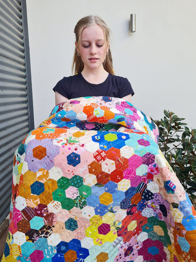
My Quick, Easy Formula for Choosing Fabrics for Ice Cream Soda Quilt
Choosing Colours for Ice Cream Soda Quilt
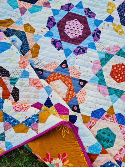
If you've come to Ice Cream Soda Quilt like I did, with lots of experience putting two colour blocks together for machine piecing, or sewing scraps together at random, then this quilt, with its small pieces and shapes sewn together in rounds rather than rows, can feel like quite the learning curve!
Through lots of practice and making blocks I don't like, I've discovered a good little formula for choosing colours for Ice Cream Soda quilt that I think will help you make blocks you love. This tutorial can be followed whether you use a collection, a limited colour palette, or if you're making a scrappy version from scraps.
Read on to learn about contrast, value, print size (and more!), and how you can use them easily to create striking, beautiful Ice Cream Soda quilt blocks.

Contrast is Your Friend
When I first started making my Ice Cream Soda Quilt, I would put together little piles of three fabrics that I liked together, cut the fabric and baste them, pop them in a ziplock bag, and stitch them through the week. I was dismayed to discover, however, that I didn't like most of the blocks I was making.
My problem was that I was choosing to put prints together in the same way I did when randomly choosing fabrics to sew next to each other in a scrappy quilt. The magic of a scrappy quilt, in my opinion, is that the overall pattern comes in and out of focus depending on what prints you put together. Sometimes they will be similar in colour or value (light or dark), and the seam line between them will be disappear. Other times, you put contrasting prints together and a pop of a triangle or square appears, making the quilt interesting and beautiful. In both cases, I didn't think about where my fabric was cut from the print at all! I just enjoyed the focus my squares gave to different parts of a print.
Ice Cream Soda quilt works better with a different framework. I found I liked my blocks best when I put contrast at the front of my mind, rather than as an afterthought. And, I learned that I was able to make this decision best when I chose the fabrics with the size of the shape in mind (a 1" diamond is SOOO much smaller than the 3" squares I was used to working with!). I also found it helpful to have the previous round already sewn and available to place on different prints for auditioning. (Eg. placing a sewn star on different fabrics to audition fabric for the kite round.)
As a result, I've created this little formula to get your started. It should help you create a quilt of blocks that aren't all the same, but create variation and interest by highlighting different shapes in each block, while also playing beautifully together.
1. Choose a Basic for the Centre Star
First, go through your stash or fabric collection and find some basics. These are the prints that are closest to solids. They're mostly one colour, but they could have flecks or highlights of a different colour. My favourite basics to use are non-directional prints. That means that no matter which way you cut them, they don't look upside down. When I have prints like this, I can use strip cutting for my shapes.
Cut 6 diamonds from your favourite basic fabric, then baste and sew your star together. For this process, it's best if you sew the star together now, rather than choose your 3 prints for the whole block first. You'll get a much better sense of how the next round will look with the first one if you sew it together before choosing the next round.

2. Choose a Contrasting Print for the Kites
Quickly pare down your options for the next round by looking for prints that contrast the star in these three areas:
- Value: Choose a print that is much darker or lighter than your star (this is also known as volume).
- Colour: Choose a print that is warm or cool in contrast to your star.
- Scale: Choose a print with a bigger/smaller/different style of pattern than the star. (Eg. You could choose a geometric print if your star features a floral.)


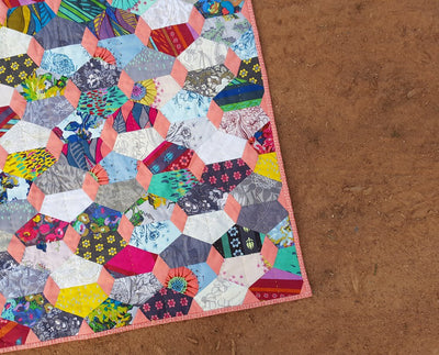
I went through my stash and found a few prints that are light blues and aquas, navies, and some whites and creams, too. I looked for relaxed geometrics because my centre star is so orderly and also floral.
When choosing my next round, I look for a fabric that will 'talk' to the one before it. For example, in my centre star, I have a mostly plum background, with white and red flowers. So, even though I might choose a completely different colour, I look for something that also has white or red or plum in it so that, even though there's contrast, there's also something tying the two together. It's not necessary, but sometimes it helps prints sit together nicely.
I really liked the navy above, but settled on this low volume plaid because I like that it has the same plum colour in it but brings in new colours (aqua and gold). It's also different in style (it's more relaxed), scale, and volume from the centre star. The plum is relatively high volume, and the plaid is low volume. (If you're unsure, take a photo and turn it black and white. It will show if there's any contrast between the prints you're choosing).
Depending on the type of print you choose, you might decide to fussy cut, or at least intentionally cut with motif and direction in mind. I decided to cut it so the gold line was running from side point to side point across the kite. I didn't worry about the vertical lines. If I hadn't worried at all about direction, this round could have looked messy. Cutting intentionally can help increase contrast and make the block feel tidy and beautiful.


3. Choose a Balancing Print for the Crowns
The crown print really sets the vibe for the whole block. It's the border, and also has the largest total fabric coverage. If your block feels a bit busy, the crowns can settle the whole block down. Or, if it's a bit boring, they can add a bit of interest. This is why I like to have the first two rounds sewn before I choose the crowns - you can't tell what the block needs unless it's half made and ready for the final touch!
I grabbed a bunch of prints that I thought might work well for the final round. Scattered florals, large florals, and scattered geometric prints all in a range of colours and volume. I assumed I would choose something dark for this round because I had a print that was medium (in the centre) and one that was light (in the kites), but when I moved the block around on the different prints, the one that really sang to me was the scattered aqua floral. I like the contrast in colour and style to the other prints. But I also liked that it had hints of gold, plum, and white to connect it to the rest of the block.

4. If you change your mind, swap it out.
The best way to see if you really like it is to cut and baste the shapes. Before I start stitching, I always lay it out first, just to check. If I don't like it, I can choose something else and save the crowns (or the kites) for a different block. Fabric always seems to look different cut to shape!
Now that I've made this block, I'm taking one bit of learning for next time. I think I would love it even more if my centre star was less busy and more solid. It's not a deal breaker for me, just something to keep in mind. It could be that the white kites bring out the white flowers and make it look busier, so next time I might go with something darker after all.

No block needs to be perfect for your quilt to be beautiful. But, each block can teach you more about how the different combinations make you feel.
5. Batch prep for making one round at a time.
It's even quicker (and I think more fun!) if you make a bunch of each round in one sitting. Grab all your favourite basics and make a bunch of stars, then pull out a collection of favourite medium prints and choose several kites at once. Then repeat with different (or the same!) prints for the crowns.
One of my favourite things about this method is that it takes the pressure off each block. When you're making 10 at a time, you're getting an overall feel for the direction you want your quilt to go. You don't need each block to be perfect, it just needs to fit in the bunch.

Now you have an easy formula for choosing fabric for your Ice Cream Soda Quilt (or any block made in rounds)! As you get more practice, you'll quickly be able to dig out your fabrics according to scale, volume, and colour, and get a sense for what you like and what you don't. The key is contrast!
Want help building a super useful stash for EPP? Head here for my fabric shopping guide!


Thankyou for this. It is so timely as I had set aside this afternoon to start choosing my fabrics from my stash. Now I know where to start. I have an overall colour scheme I would like to aim for, now I can start picking some basics to get me started. Cheers!
Thank you for this advice. I will try it out.
Beautiful pattern, I’m making my quilt with Christmas/Winter fabric. It is going well.
This is very interesting and gives me a whole new perspective. In the few blocks I have done, I have approached it in the opposite way. LOL I have been starting with the crowns, because they are the largest and seem to lend themselves so well to fussy cutting. Then I work on the stars and kites together, to accent the crowns. I think maybe I need to have some where the crowns are not all fussy cut feature prints, to add more variety to my quilt. Thank you for sharing your process!!!
Gosh this is so timely! I’ve spent the weekend tying myself in knots trying to choose fabric and not knowing where to begin. Choosing fabric is always my Achilles heel. I have a very small stash, which contains a lot of “this does not play well together…” I was entirely lost. Thanks for the lighthouse so I can avoid the rocks!! :)
Leave a comment